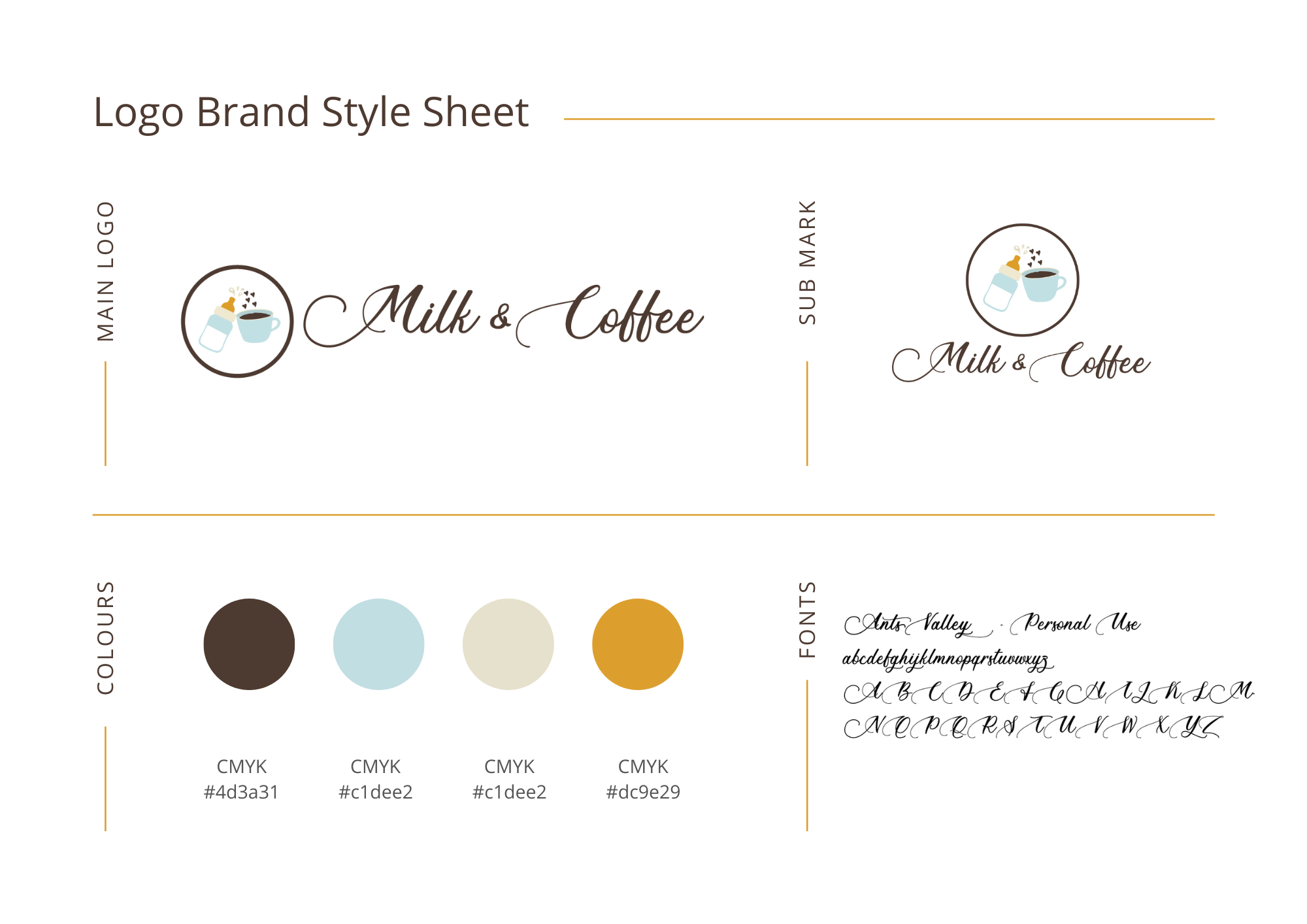
When it comes to branding and choosing brand colors other visual elements play a role in creating a lasting impression. Among these elements, colors emerge as the conductors, orchestrating the mood, personality, and identity of a brand. This blog post aims to delve into the art of choosing colors for your brand, unraveling the psychological nuances, cultural considerations, and practical tips that can guide you in creating a cohesive and compelling brand identity.


The Psychology of Colors
Red: Passion and Energy
The color red ignites a profound sense of passion, energy, and excitement. It’s a bold choice for brands seeking to stand out in a crowd and create a compelling sense of urgency. Red is a powerful conductor of attention, making it an ideal choice for brands that want to make a bold and memorable statement.
Blue: Trust and Professionalism
Blue, with its calming and trustworthy aura, is synonymous with professionalism. It’s a reliable choice for corporate brands aiming to convey stability and trustworthiness. Whether it’s the deep navy of a financial institution or the vibrant blue of a tech giant, this color can instill a sense of confidence in your audience.
Green: Nature and Wellness
Symbolizing nature, growth, and wellness, green is often the go-to choice for brands associated with sustainability, health, and the environment. Whether you’re in the business of organic products or promoting a healthy lifestyle, shades of green can communicate a connection with nature and a commitment to well-being.
Yellow: Optimism and Clarity
Radiating optimism and clarity, yellow is an excellent choice for brands looking to convey positivity and innovation. This vibrant hue captures attention and exudes a sense of friendliness. Brands that want to stand out as approachable and forward-thinking often incorporate yellow into their color palettes.
Purple: Luxury and Creativity
Often associated with luxury, creativity, and sophistication, purple is a compelling choice for brands aiming to convey a sense of exclusivity. Whether it’s a high-end product or a brand with a focus on artistic expression, purple adds a touch of elegance and creativity to the visual identity.
Orange: Energy and Playfulness
Orange, with its energetic and playful demeanor, is a vibrant choice for brands that want to convey enthusiasm and friendliness. It’s a color that sparks excitement and can be particularly effective for brands targeting a youthful and energetic audience.
Neutral Tones: Elegance and Simplicity
When it comes to timeless choices, neutral tones such as black, white, and gray convey elegance, simplicity, and versatility. These classic hues provide a sophisticated backdrop, allowing other colors or elements to shine. Neutral tones are often the foundation of minimalist and timeless brand identities.
Practical Tips for Choosing Colors
Know Your Audience
Understanding your target audience is the first step in choosing the right colors for your brand. Consider their preferences, demographics, and cultural background. Colors that resonate with your audience create a stronger emotional connection.
Consider Industry Standards
While uniqueness is essential, it’s crucial to consider industry standards. Certain colors are conventionally associated with specific sectors. Deviating too far from these standards might confuse your audience rather than make your brand memorable.
Test for Accessibility
Ensuring that the colors you choose are accessible to all users, including those with visual impairments, is paramount. Strive for a balance between aesthetics and inclusivity, making your brand welcoming to a diverse audience.
Limit Your Palette
While variety adds richness to life, too many colors can dilute your brand identity. Establish a limited color palette that reflects your brand personality and maintains consistency across all branding materials.
Test in Different Contexts
Colors can appear differently on various screens and in print. To ensure consistency and visual appeal, test your chosen colors across different mediums. This step is crucial in adapting your brand’s visual identity to the diverse contexts it may encounter.
In the grand symphony of brand building, colors play a pivotal role in composing the visual narrative. By understanding the psychology behind each color and incorporating practical tips into your decision-making process, you can orchestrate a visual masterpiece that resonates with your audience and leaves a lasting impression. The canvas is yours—paint it with the colors that define your brand’s identity. Here are two more helpful articles.

