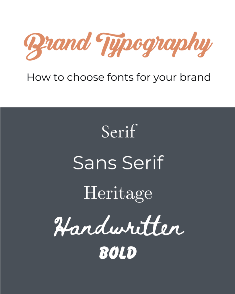
In the ever-evolving landscape of branding and marketing, your business's visual identity plays a pivotal role in attracting and retaining customers. One of the most critical elements of this identity is the choice of brand fonts. Your brand font selection should be carefully considered, as it communicates your brand's personality, story, and values to the world. In this blog post, we will explore the art of choosing brand fonts based on your business type, story, and more.

Know Your Business Type
Every business falls into a specific category or industry, and understanding your business type is the first step in selecting the right brand fonts. Your industry can influence font choices significantly. For instance:
a. Serif Fonts for Elegance: If your business is in the luxury industry, such as high-end fashion or fine dining, serif fonts like Times New Roman or Didot can convey a sense of sophistication and tradition.
b. Sans-Serif Fonts for Modernity: Tech startups, e-commerce platforms, and other modern businesses often opt for sans-serif fonts like Helvetica or Arial to project a sleek and contemporary image.
c. Playful Fonts for Creativity: Creative businesses like design studios, event planners, or children's brands may benefit from playful and unique fonts that add a touch of imagination and fun.
Align with Your Brand Story
Your brand's fonts should complement and enhance your brand story. Consider the message you want to convey and the emotions you want to evoke in your audience. Here are some examples:
a. Classic Fonts for Heritage: If your brand has a rich history and heritage, classic fonts like Baskerville or Garamond can emphasize tradition and authenticity.
b. Handwritten Fonts for Personal Connection: Businesses with a personal touch, such as artisanal products or family-owned restaurants, can use handwritten fonts to create a warm and personal connection with customers.
c. Bold Fonts for Confidence: A bold and confident brand story can be accentuated with strong, impactful fonts like Futura or Bebas Neue.
Target Audience Matters
Your target audience plays a crucial role in the font selection process. Different demographics respond to fonts in distinct ways. For instance:
a. Formal Fonts for B2B: If your target audience is primarily other businesses, you might opt for formal fonts that project professionalism and reliability.
b. Youthful Fonts for Gen Z: Brands targeting a younger audience should consider fonts that reflect their energy and enthusiasm, like Avenir or Open Sans.
c. Timeless Fonts for General Appeal: For a broad and timeless appeal, neutral fonts such as Calibri or Arial are versatile choices.
Consistency Across Platforms
In today's digital age, your branding extends across various platforms, from your website and social media to physical signage. It's crucial to ensure consistency in font usage across all these channels. This consistency builds a strong and recognizable brand identity. Choose fonts that are web-friendly, legible on various devices, and scalable without losing quality.
Consider Readability
The primary function of text in your branding is to convey information. Your chosen fonts must be easily readable, both in print and digital formats. When considering readability, take into account factors like font size, spacing, and contrast with the background. Fonts like Arial and Times New Roman are known for their readability, making them suitable for large bodies of text.
Test the Compatibility
Sometimes, you may need multiple fonts to create a visually appealing brand identity. In such cases, make sure the fonts you choose are compatible with each other. Pairing fonts requires a balance between contrasting elements, such as serif and sans-serif or bold and italic. Websites like Google Fonts offer suggestions for font pairings to ensure harmony in your design.
Test Emotional Resonance
Fonts can evoke a wide range of emotions and feelings, and it's essential to test how your chosen fonts resonate with your target audience. Run surveys or conduct A/B testing to gauge your audience's emotional response to different font choices. This can help you fine-tune your selection to create a stronger connection with your customers.
Be Unique, But Not Too Unique
While it's essential to stand out in a crowded market, going too far with unconventional fonts may alienate your audience. Aim for a balance between uniqueness and legibility. A slightly customized font or a distinctive typeface can make your brand memorable without sacrificing readability.
Choosing the perfect brand fonts for your business is a meticulous process, as fonts are a visual language that speaks to your customers. By considering your business type, aligning with your brand story, targeting your audience, ensuring consistency, and paying attention to readability, compatibility, and emotional resonance, you can craft a brand identity that leaves a lasting impression. Remember that your font choices should evolve with your brand, staying true to your story while adapting to changing trends and customer preferences. Invest the time and effort in selecting the right fonts, and watch your brand's visual identity come to life.
