When someone looks up your business, what do they see—especially on their phone? These days, mobile-first web design isn’t just a buzzword. It’s essential.
Over 60% of all website traffic comes from mobile devices. That means more than half of your potential customers or clients are seeing your site on a phone. And if your website isn’t built to work well on that smaller screen, you’re likely losing them—before they ever give you a chance.
At SunnValley, a professional NH web design company, we specialize in modern websites that look great, load fast, and are designed to work perfectly on mobile. Whether you’re a town office, contractor, or local business owner, understanding how mobile-first web design works—and why it matters—can help you make smart choices about your online presence.
What Is Mobile-First Web Design?
Mobile-first custom web design is an approach where we design for smaller screens first (like smartphones), then expand the layout for tablets and desktops. It flips the traditional design process. Instead of starting with a large desktop layout and squeezing it into a mobile version later, we focus on the most important features and user needs from the start.
Why does that matter? Because when a site is built for desktop and then shrunk down, it often becomes cluttered, hard to navigate, or frustrating on a phone. Designing mobile-first keeps everything clean, simple, and focused.
Mobile-First Is Now the Standard
Google now ranks websites based on their mobile version. This is called mobile-first indexing, and it means your mobile site is the version that Google uses to judge how your site performs in search engine results.
Studies show that 88% of users are less likely to return to a site after a bad mobile experience. And 57% of users say they won’t recommend a business with a poorly designed mobile site. Those are huge numbers. Your website isn’t just a digital business card anymore—it’s your reputation.
For a small business or town in New Hampshire, where people often search on the go, having a mobile-optimized site could be the difference between a new customer and a missed opportunity.
What Are UX and UI—and Why Do They Matter?
When we talk about building a modern website, we also focus on UX and UI. These two elements go hand in hand with mobile-first, professional web design.
UX stands for User Experience. This is how someone feels while using your site. Is it easy to navigate? Can they quickly find what they need? Does the site load fast? A great UX design keeps visitors engaged and happy. On mobile, this is especially important—because people are in a hurry.
UI stands for User Interface. This is how your website looks and responds. It includes things like layout, color schemes, typography, buttons, icons, and interactive features. Good UI makes your website attractive and usable, while bad UI creates confusion and frustration.
At SunnValley, our web design projects combine clean UI with thoughtful UX—especially when we’re designing for mobile-first.
Signs Your Website Is Outdated
If your website hasn’t been updated in several years, there’s a strong chance it isn’t mobile-first. Even if it opens on a phone, that doesn’t mean it was designed for mobile use.
You might notice issues like:
- Small text that’s hard to read without zooming
- Menus that are difficult to tap or use
- Pages that take too long to load
- Confusing layouts or broken images
- Outdated styles that don’t reflect your brand today
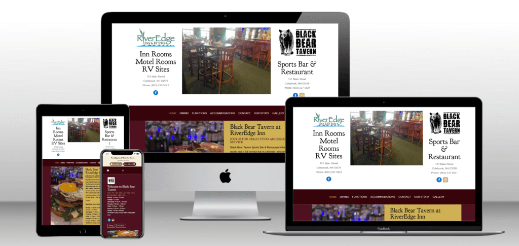
In the past few years, we’ve helped many businesses and town offices across New Hampshire update their websites from outdated, desktop-only versions to modern, mobile-first designs. The result is always a faster, more user-friendly site that performs better in search results and builds more trust with visitors.
Why Redesigning Your Website Makes Sense
If your site feels outdated, hard to navigate, or slow on mobile, it’s time to consider a redesign. This doesn’t mean starting from scratch—it means improving what you already have with modern tools and a mobile-first approach.
A website redesign from SunnValley, your local NH web design agency, includes:
- Mobile-first web design to prioritize speed and ease of use
- Improved layout and navigation for better UX
- Clean, modern visuals that reflect your brand
- Built-in tools so you can easily manage your own updates
- Optional add-ons like document libraries, calendars, and contact forms
Whether you’re running a business or managing a town website, an updated site will help you better serve your visitors and grow your reach.
What If You’re Just Getting Started?
Launching a new business or project? Now’s the perfect time to do it right from the beginning. A mobile-first website gives you a solid foundation that can grow with your needs.
You don’t need to be tech-savvy. We’ll walk you through the entire process and deliver a website that’s not only beautiful, but also easy to use and maintain.
We’ve helped towns like Colebrook, Columbia, and Stratford NH upgrade their web presence with mobile-first design and organized content management. We’ve also worked with local contractors, retail shops, photographers, and startups to build effective, easy-to-navigate websites from the ground up.
Let’s Talk About Your Website
Your website is often the first impression someone gets of your business or organization. If it’s outdated or hard to use on a phone, it could be doing more harm than good.
That’s where we come in. At SunnValley, we specialize in nh web design that prioritizes mobile-first strategies, strong UX and UI design, and clean, modern visuals that connect with your audience. Whether you're upgrading an old site or starting fresh, we make the process easy, affordable, and stress-free.
Want to see what mobile-first web design could do for you?
Visit sunnvalley.com or email roxanne@sunnvalley.com